Visualization template · Managers
KPI scorecard
Targets vs actuals at a glance. Made from one message, so you can get your own in minutes.
KPI scorecard
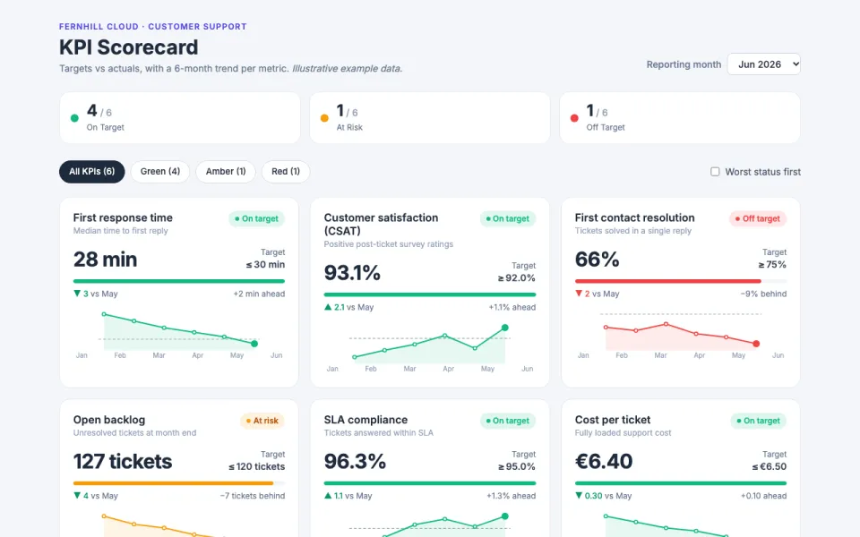
Targets vs actuals at a glance
The prompt
Create an interactive scorecard visualization for the Customer Support team at Fernhill Cloud with 6 KPIs (First response time, CSAT, First contact resolution, Open backlog, SLA compliance, Cost per ticket). Each card shows actual vs target, a sparkline of the last 6 months and a red/amber/green status. Data: example data.
Make it yours
- Change the details in the prompt to fit managers.
- For example, change it so that so that it is for the Warehouse Operations team at a regional grocery distributor with 5 KPIs: order accuracy, on-time dispatch, pick rate per hour, damage rate and overtime hours and the status colors use a colorblind-friendly blue/orange/purple palette.
- Ask for edits in plain words: tone, colors, length, layout or data.
- Share the result by link or export it when you are done.