Visualization template · Personal finance
Where my money goes
Monthly spending by category. Made from one message, so you can get your own in minutes.
Where my money goes
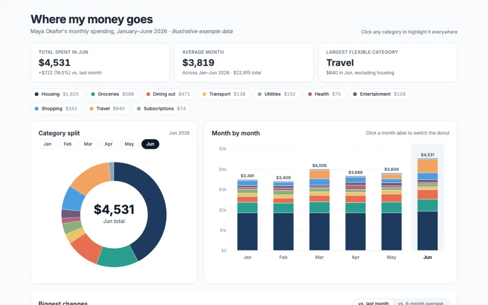
Monthly spending by category
The prompt
Create an interactive chart of my monthly spending: a donut chart by category (Housing, Groceries, Dining out, Transport, Utilities, Health, Entertainment, Shopping, Travel, Subscriptions), a month-by-month stacked bar chart, and a list of the biggest changes. Clicking a category highlights it everywhere. Data: example data for January–June 2026 for Maya Okafor, a freelance illustrator renting a one-bedroom apartment in Portland.
Make it yours
- Change the details in the prompt to fit personal finance.
- For example, change it so that it tracks a two-person household in Chicago with a toddler, adding Childcare and Pets as categories and the data covers July–December 2026 with a monthly budget line for each category.
- Ask for edits in plain words: tone, colors, length, layout or data.
- Share the result by link or export it when you are done.