Visualization template · Buyers & analysts
Radar comparison
Compare options on many traits. Made from one message, so you can get your own in minutes.
Radar comparison
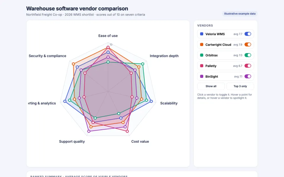
Compare options on many traits
The prompt
Create an interactive radar chart comparing five warehouse management software vendors (Veloria WMS, Cartwright Cloud, Orbitrax, Palletly and BinSight) on seven criteria (ease of use, integration depth, scalability, cost value, support quality, reporting and analytics, and security and compliance), with scores out of 10. Toggle each option on or off, and show a ranked summary underneath. Data: example data from Northfield Freight Co-op's 2026 vendor shortlist review.
Make it yours
- Change the details in the prompt to fit buyers & analysts.
- For example, change it so that it compares four project management tools for a 12-person design agency in Lisbon on criteria like client sharing, time tracking, and price per seat, and the ranked summary weights client sharing twice as heavily as the other criteria.
- Ask for edits in plain words: tone, colors, length, layout or data.
- Share the result by link or export it when you are done.